Designing on Principle: A #MakeoverMonday Design Analysis (Guest Post)
The following is a guest blog post from David Borczuk. David is a clinical data analyst in the pharmaceutical industry who leverages Tableau to provide oversight to clinical trials. He recently joined the #datafam community and participates in the weekly Makeover Monday challenges. He is passionate about user interface, user experience, and information design, and combines these three disciplines together to build his Tableau visualizations. You can follow him on twitter @datavizDB
There are seven key principles of design: Balance, Contrast, Emphasis, Movement, Pattern, Rhythm, and Unity. I am going to explain how I used each of these design principles to make this week’s Makeover Monday (MoM) submission:
Balance
Balance is the distribution of colors, fonts, shapes, patterns, etc. throughout the design which can either be displayed symmetrically or asymmetrically:
Symmetric Design equally distributes the weights of graphical elements across a visualization, which creates a sense of organization and uniformity
Asymmetric Design however, does not equally distribute the weights of the elements, and can create feelings of tension towards, or suggest importance of different graphical components.
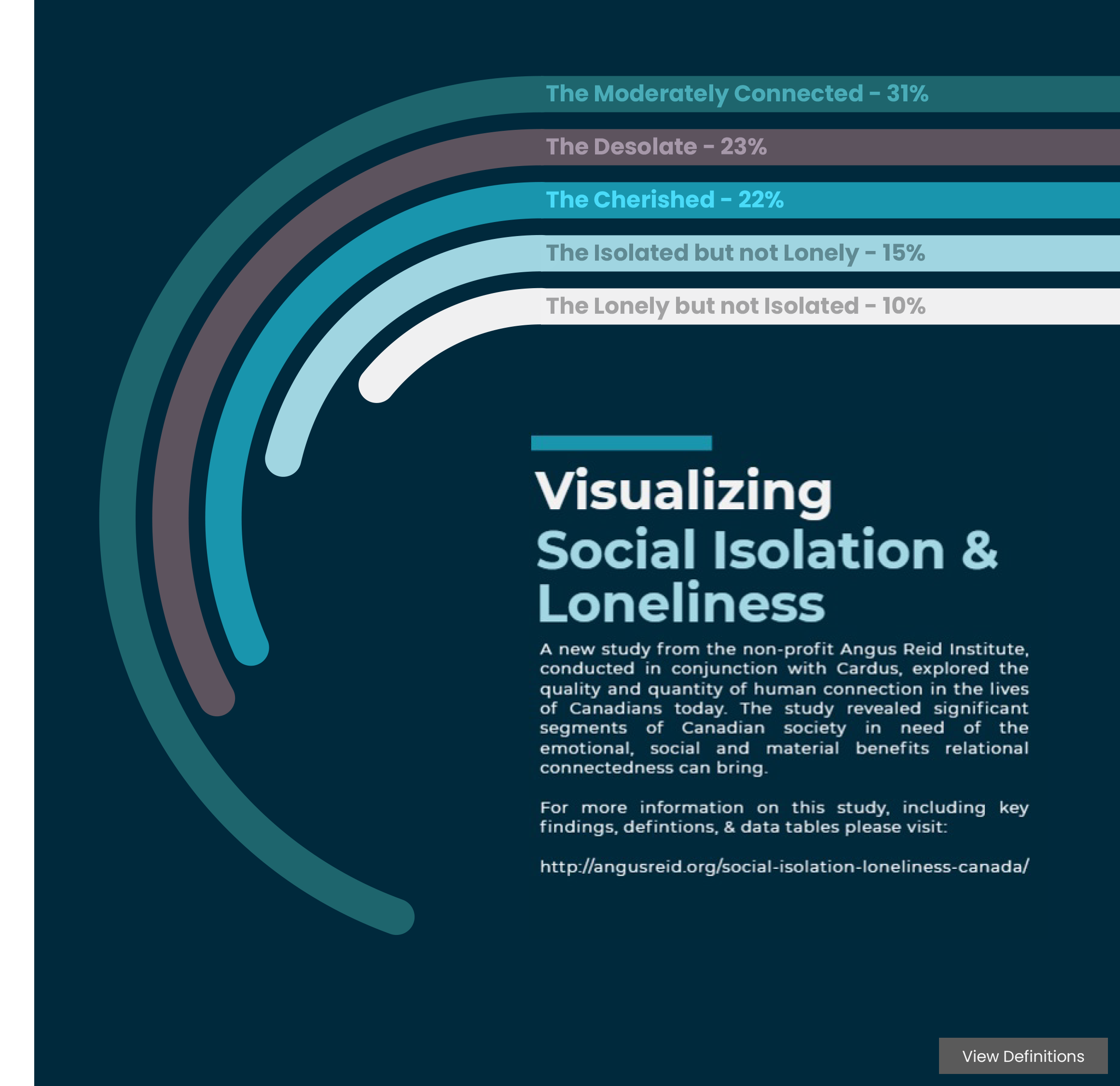
In my MoM design I practiced a symmetrically-balanced design by ensuring that all of the spacing was proportional: There are 200 pixels of right and left padding, 250 pixels in between each indicator viz, and 70 pixels of padding between the horizontal line break and the title of the next indicator viz.
Shown above is the spacing that I used to create the MoM Viz
For the header, I decided to distribute the title across three lines as opposed to one. This was done in an effort to balance the size and weight of the text to that of the legend. I really wanted to create a balanced design to give equal attention to all of the elements within my MoM viz.
Distributing the weight of type can lessen its weight, allowing for balance across a vertical axis
Contrast
How easily can the black font be distinguished from the white background of this blog post?
The magnitude of differences across graphical elements of a design is defined as its contrast.
In my MoM viz the goal was to limit the amount of contrast of the text and maximize the contrast of the visualizations. This would allow the viewer to easily compare wealth across different global indicators without being distracted by the text. Within each visualization, I placed a black border around each circle to create contrast between each of the data points. Finally, by using an array of different colors across the visualizations, I created contrast between the different global indicator categories, thereby making it easier to tell the indicator visualizations apart.
Borders on data points and muted type creates visual contrast between the titles and the visualizations.
Emphasis
Emphasis is defined as a method of attracting the eye to particular parts of the design.
While I did not apply emphasis across the different visualizations, I exaggerated the magnitude of the wealthier countries so that they stood out consistently throughout each global indicator. However, I was careful to avoid overemphasizing one visualization over another, allowing the viewer to make an unbiased comparison across each of them.
Sizing is used to effectively emphasize the variations between countries
Movement
The movement of a design impacts the way that your eye travels across different graphical elements.
For instance, when looking at most websites, our eye travels in an “F” pattern, where most of our attention is captured across the website header and navigation bar, but focus rapidly declines the further down the page we read. However, if asymmetry or emphasis is created in the design, this will disrupt the way that one would normally scan a page.
In my visualization I sought to maximize user experience by making the viewer read the data from left to right. As the viewer scans the x-axis from left to right, the numbers related to the global indicator get larger. By keeping the movement consistent across the entire visualization, this reduces the amount of cognitive load for the viewer, which reduces frustration that could result from extraneous interpretation of the data.
Consistent left-to-right ‘directionality’ of the visualizations create consistent movement throughout the design.
Pattern
Pattern can be described as the repetitive use of design elements.
My MoM viz features 5 visualizations that depict the global distribution of wealth using the same chart type, but with different categories. In a similar respect to movement, keeping a consistent pattern of visualizations across a design makes it easier for the viewer to process information without having to interpret and navigate multiple chart types. The diagram below shows all the repetitive patterns that I used in my visualization, where color indicates elements of the same pattern.
(Green) the titles for each visualization; (Yellow) the horizontal line breaks; (Red) the descriptions of each global indicator; (Blue) the indicator visualizations.
Rhythm
An important element of design is the pacing by which the viewer looks at graphical elements. This can be altered with different amounts of spacing, balance, pattern, or emphasis. In my MoM, since all elements are spaced evenly, the rhythm of the viz is uniform throughout. The position of the data points are slightly different, but the number of data points to process are consistent across all five visualizations. By promoting an even rhythm, I attempted to prevent unnecessary bias while also making it easier for the viewer to process the core information from each visualization.
Unity
Unity can be described as how well design elements work together.
In this MoM, I sought to create unity by creating consistent, horizontal visualizations where the movement of data behaves in the same way. To enhance this horizontal unity, I created line breaks that not only divide each visualization, but also conserve the horizontal motif of the design. I also tried to unify the design by picking colors of similar saturation levels (with the exception of the black color for infant mortality to emphasize the emotional connection) so that the viewer would not be distracted by colors of varying hues, saturations, and brightnesses. Finally, by creating equal spacing between elements through the MoM design, all elements appear unified by their internal and external padding.
Conclusion
Following these design principles are a great way to supercharge the aesthetics of your next visualization!
Practice slowly, concentrate on one design principle at a time, and when you feel comfortable, begin incorporating additional principles. Before you know it, you will be the next design rockstar!

Makeover Monday Week 7: How is Global Wealth Distributed Across other Government Indicators. Click on the image to access the visualization on Tableau Public.
Reference / Attribution:
Chapman, Cameron. “The Principles of Design and Their Importance.” Toptal Design Blog, Toptal, 13 Dec. 2018, www.toptal.com/designers/ui/principles-of-design.